Upcycling
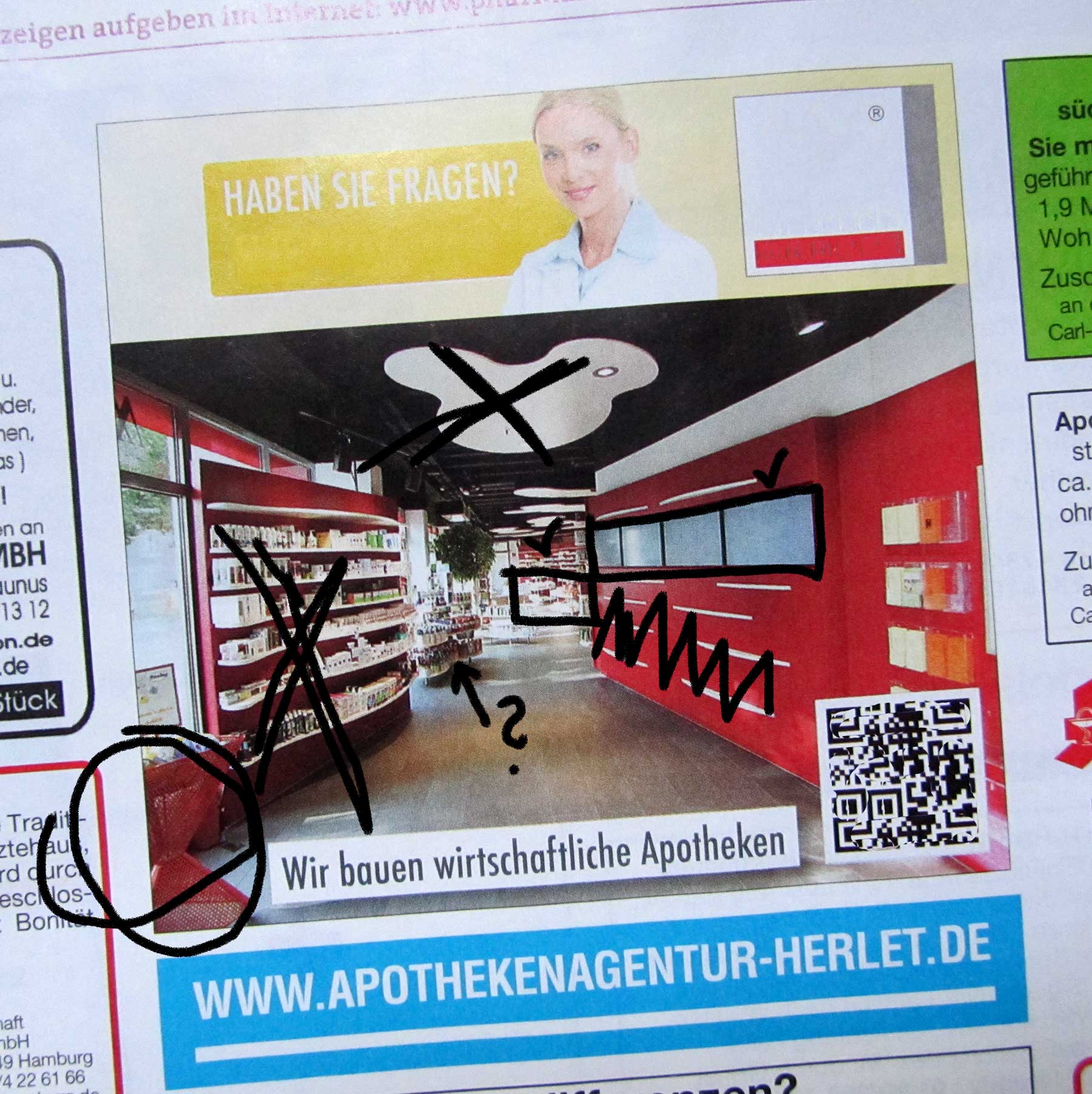
Upcycling
/ˈʌpˌsaɪklɪŋ/
Visual and technical obsolescence are two of the main forces that continually generate new revenue in markets driven by constant growth. Every facelift makes the previous generation of a car look outdated, and suddenly a smart tumble dryer appears indispensable. Neither our limited natural resources nor the environment benefit from this.
In 2014 I was invited to Mallorca as a speaker at the Management Congress, where I gave two lectures on design and the effects of colour. After one of the presentations, a pharmacist approached me whom I had apparently left feeling rather uncertain.
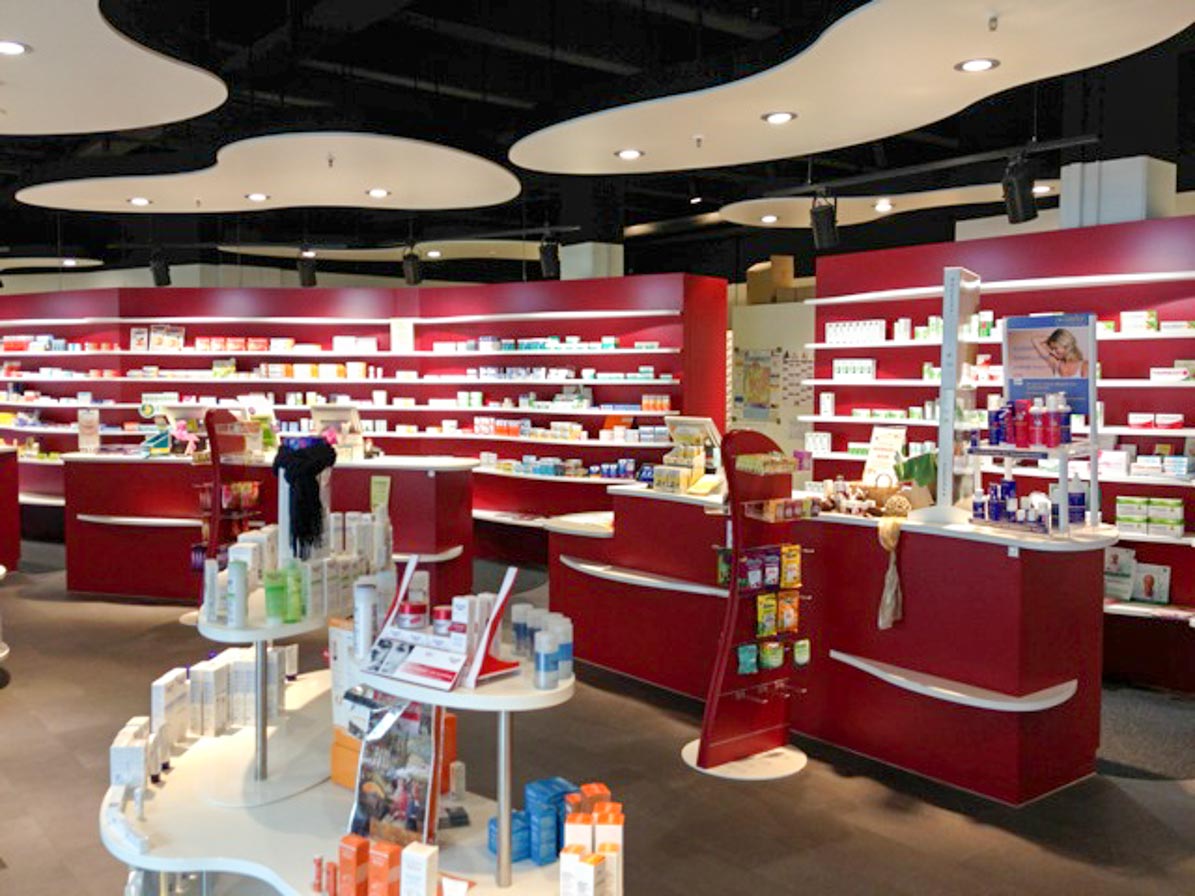
Now that’s seeing red! White clouds beneath a black sky.
She had purchased the fittings of a pharmacy that had unfortunately been forced to close—only a few years old and for one tenth of the original price.
A bargain, certainly. But would anyone really want to spend every day working in it?
The remarkable thing was that the interior had originally been very expensive. I even saw the original invoice. It demonstrated one thing with startling clarity: a high price does not guarantee good design.
A bargain purchase
Here are a few impressions of what the acquired interior originally looked like.
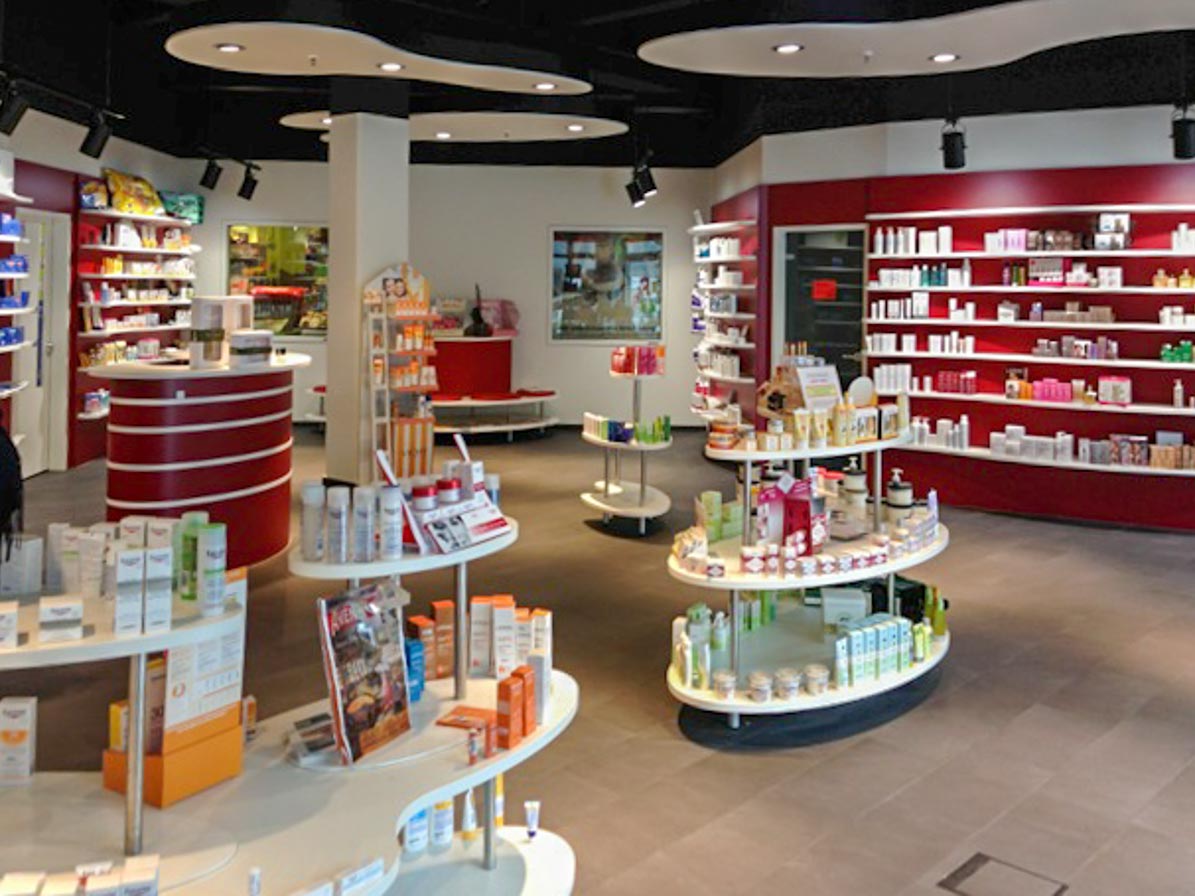
Red and white chipboard. Amoeba-like forms loosen up the overall appearance…
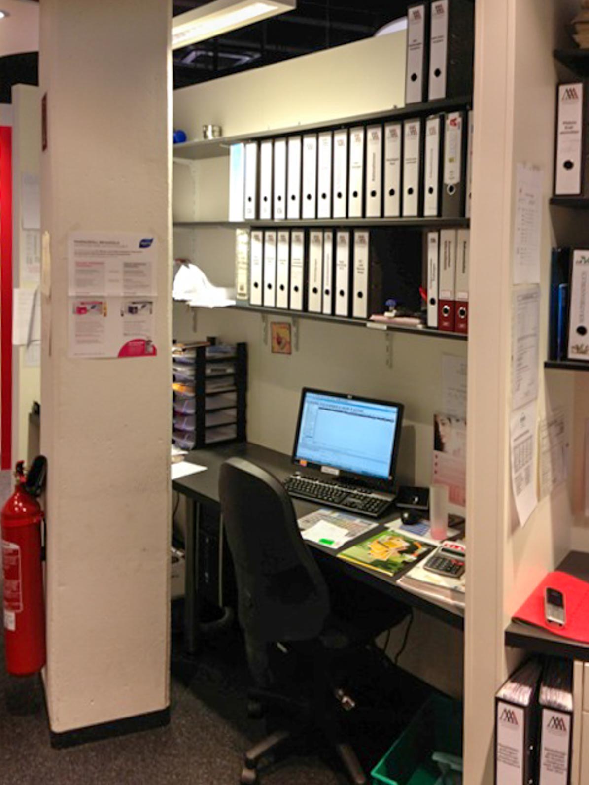
The rear of the shelving. Contact with the dispensary only by X-ray vision.
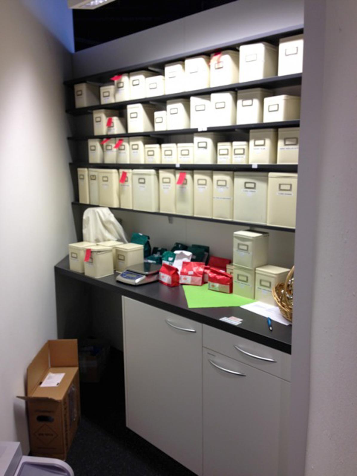
The herbal preparation area. Every corner was put to use…
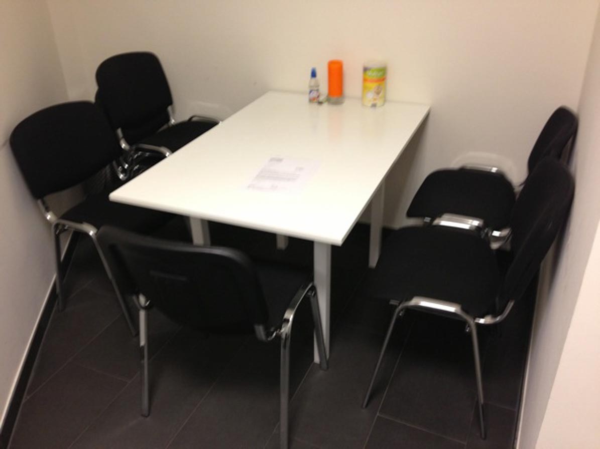
So employees don’t take breaks that are too long.
The entire pharmacy had already been dismantled and stored, and there was even an initial proposal showing how these components might be arranged in a new floor plan.
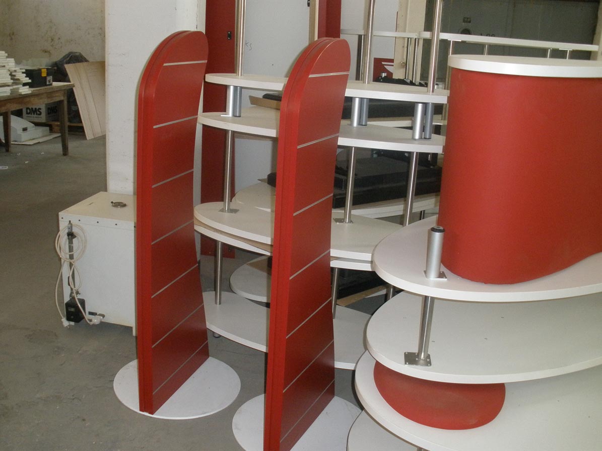
Stored away. Keep the good pieces, discard the rest.
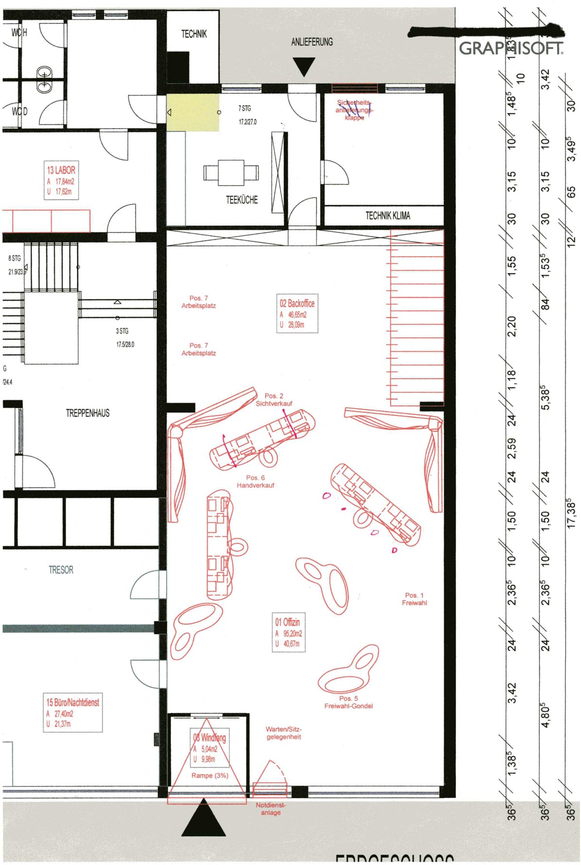
Original floor plan.
Turning a donkey into a racehorse
This posed a completely new challenge. How on earth was I supposed to transform this collection of cheap-looking furniture into a pharmacy I could honestly stand behind? At the same time, I couldn’t simply throw everything away. For a moment I considered declining the commission.
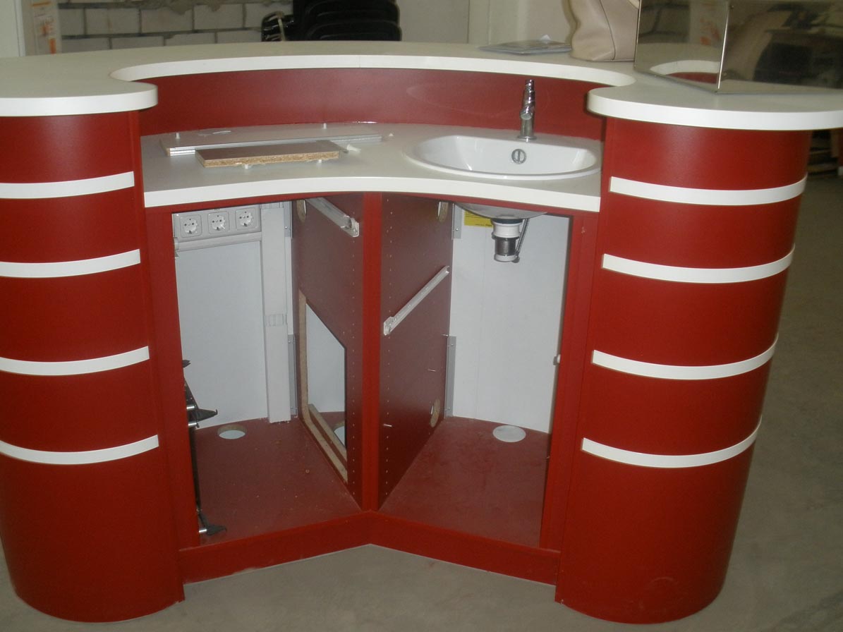
Matches and a can of petrol?
But I liked the pharmacist, and I have always believed that if someone truly wants help, it can be given.
So I travelled to Hagen-Hohenlimburg to see the new premises.
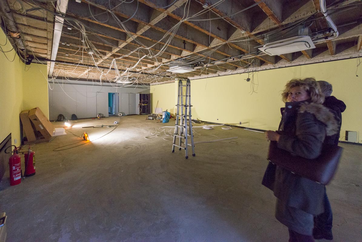
First a bank, then a kindergarten, now a pharmacy.
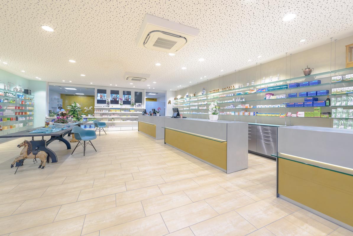
A small preview of the final result.
It turned out that only two buildings away from the old Sonnen Pharmacy, at the entrance to the pedestrian zone, stood the Martin Luther House. Its ground floor offered larger, accessible premises for the new pharmacy.
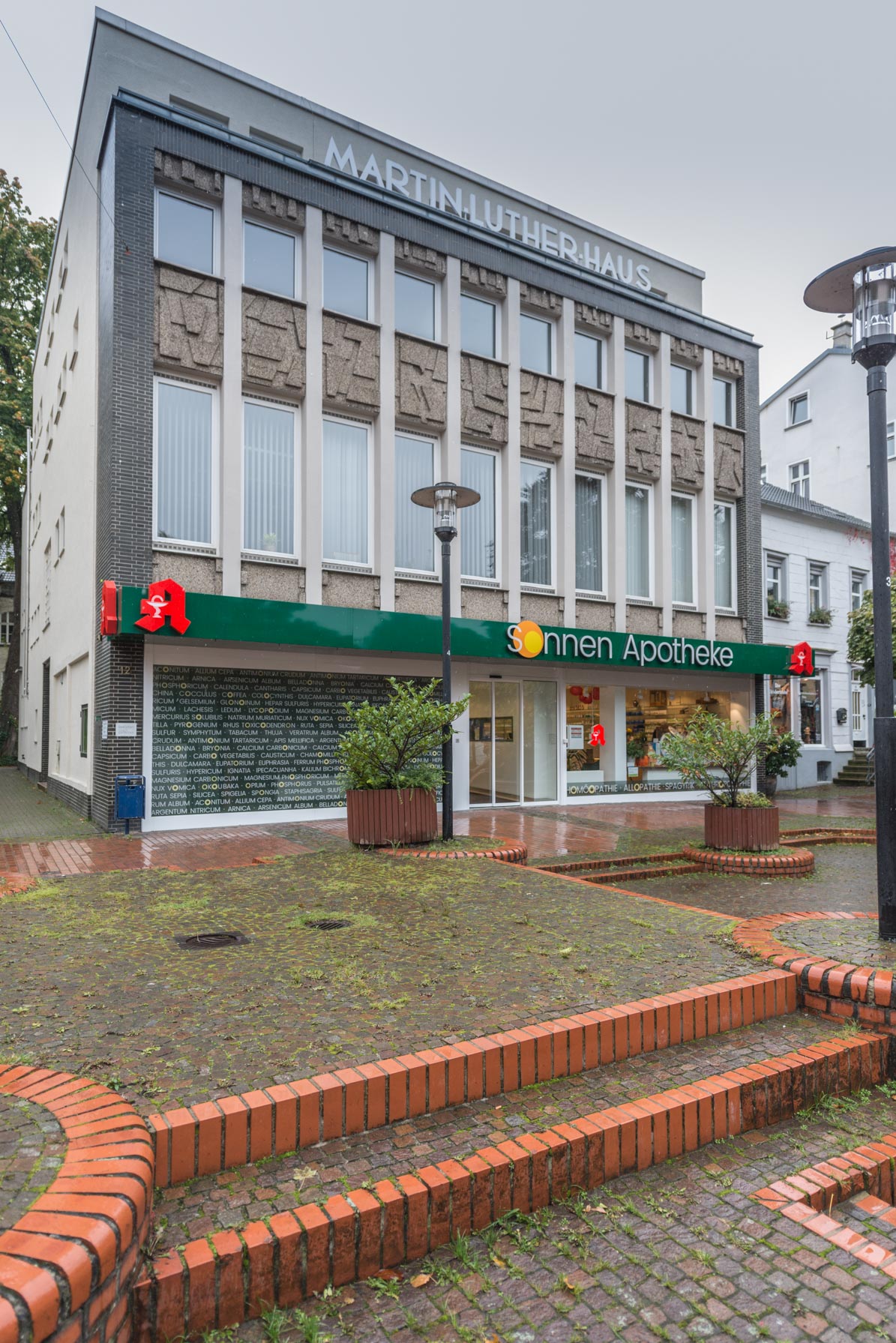
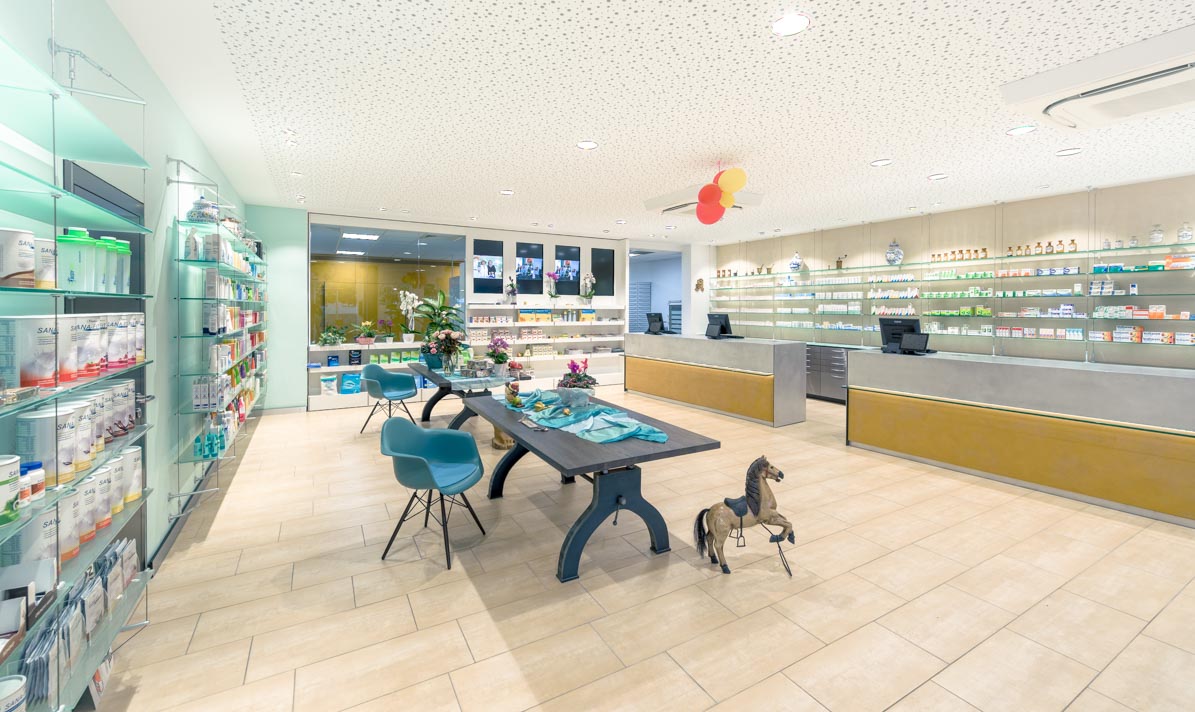
The completed pharmacy in the Martin Luther House.
Mrs Vespermann had very clear ideas about both the functional requirements and the atmosphere she wanted.
Fortunately she was open to every suggestion, and over a pizza next door we developed the concept for the new floor plan.
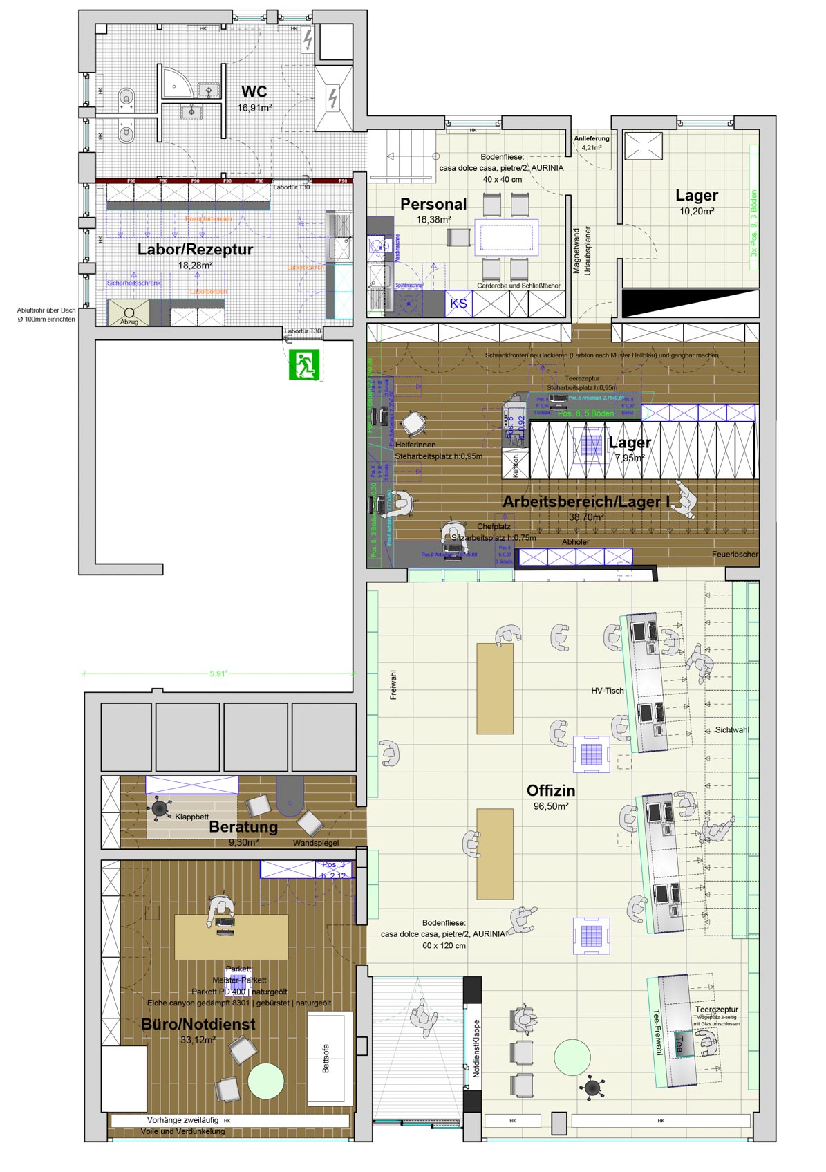
The new layout.
Every single piece of furniture was examined, measured and evaluated before deciding where and how it could be reused.
One thing, however, was beyond discussion: the red partition walls had to disappear. A sun should only be red when it is setting.
If you want to make an omelette…
Even though the budget was tight, much of the dispensary had to be rebuilt. Otherwise I would have gone on strike.
Fortunately, that required less than expected.
The first priority was to create a bright, sunny atmosphere.
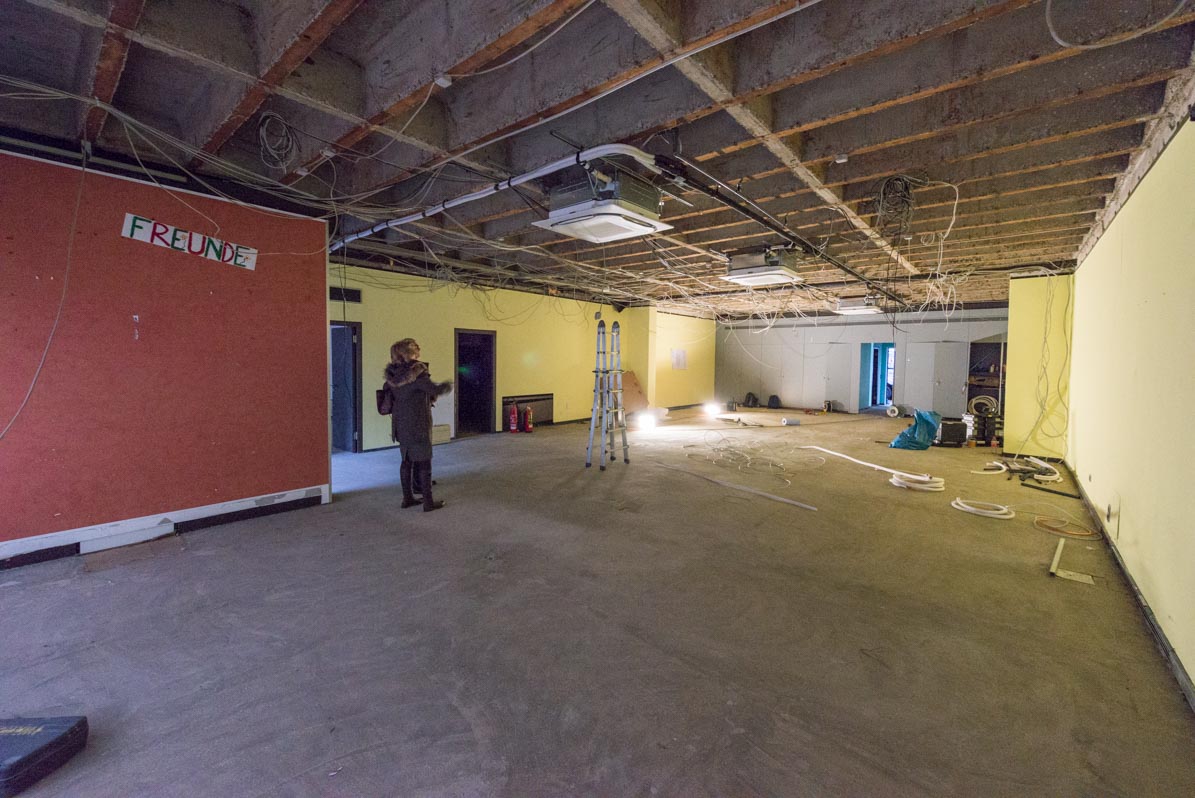
The shell.
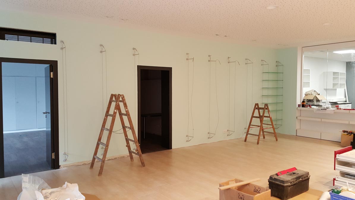
A delicate turquoise shelving wall combined with a sand-coloured floor.
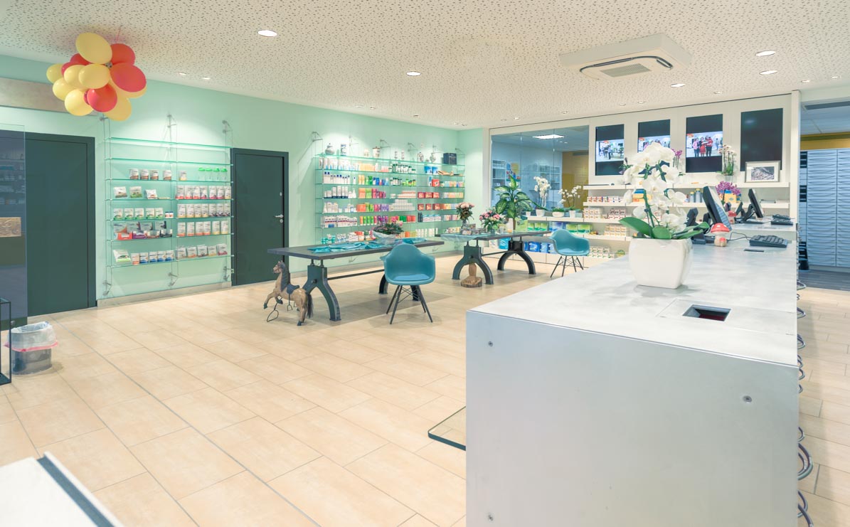
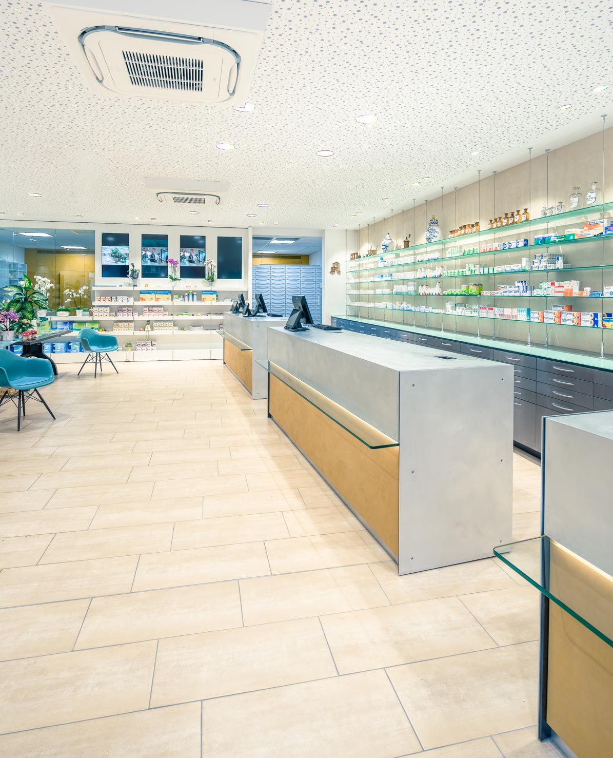
The finished dispensary radiates freshness, order and openness.
For the shelving we used the Shopkit cable system. The refreshing turquoise forms a warm–cool contrast with the sunny yellow dispensing counters and shelving. The industrial table frames reference Hagen’s tradition of steel and coal production.
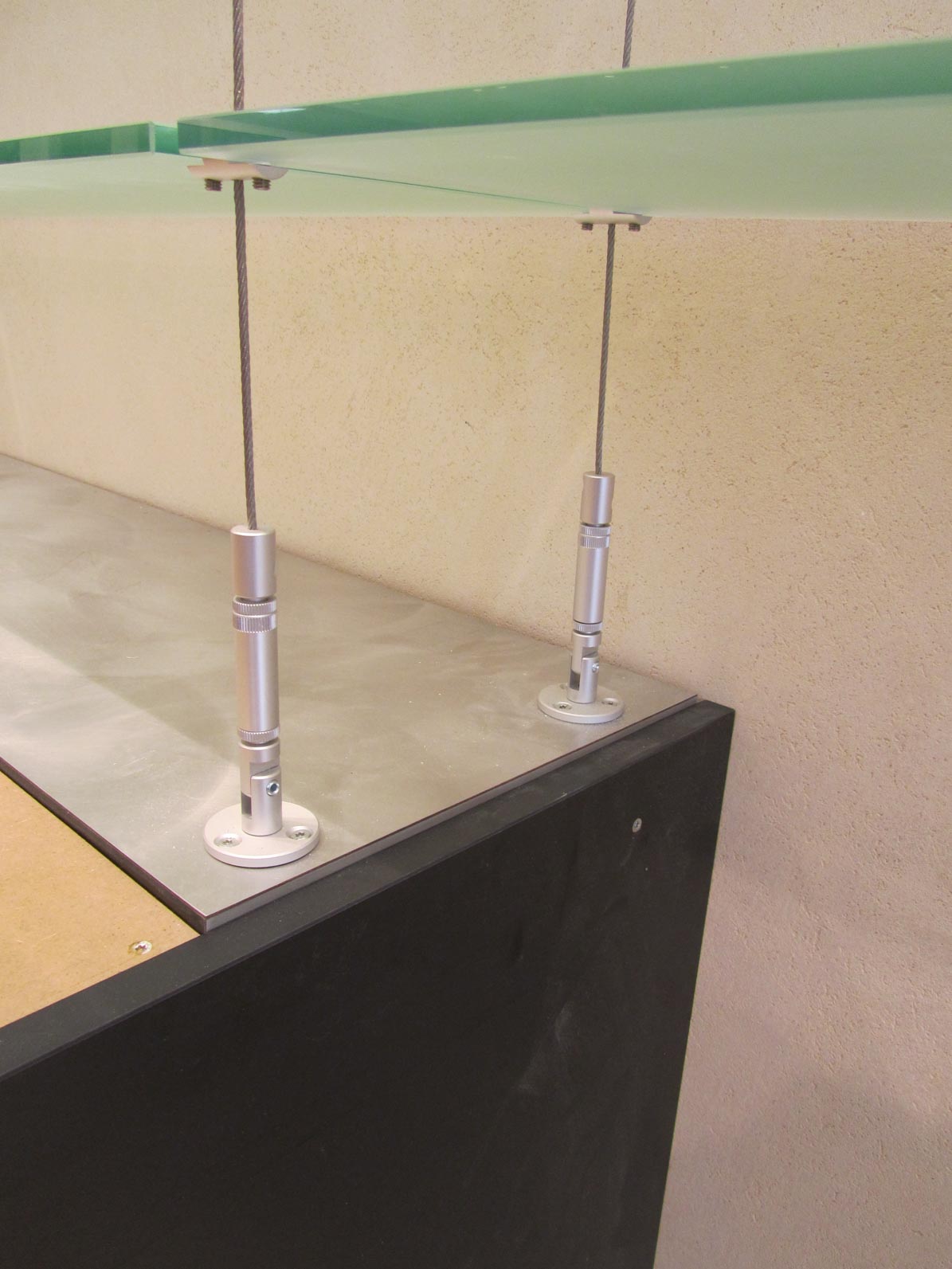
Cable system.
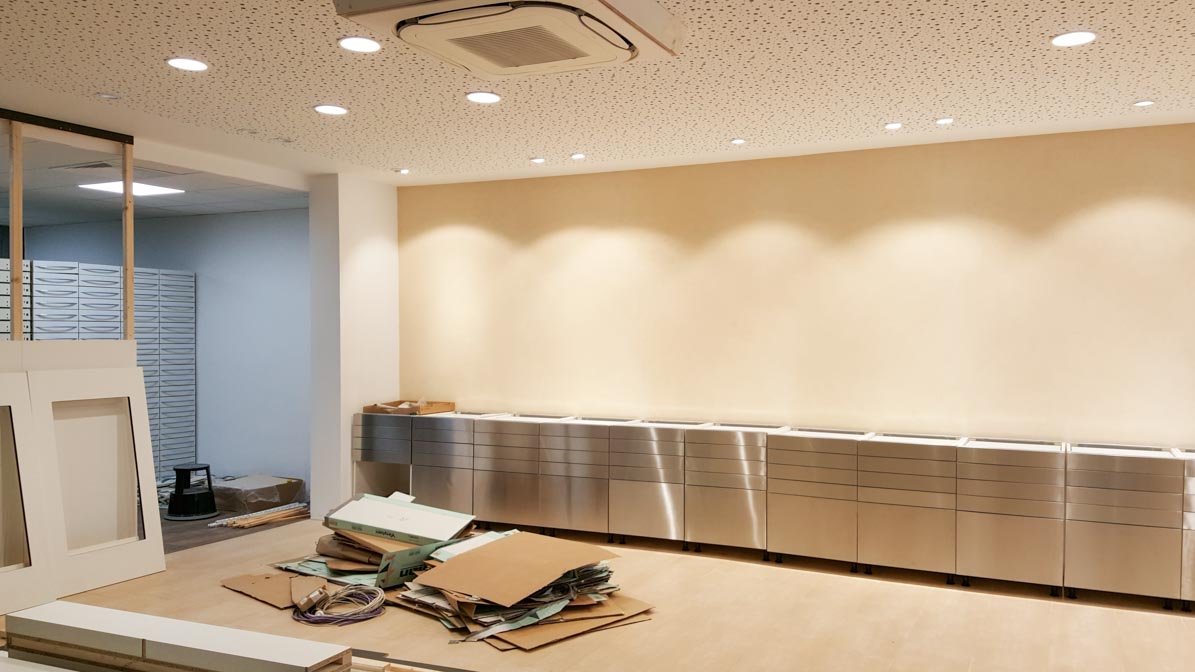
Shelving in sandy beige.
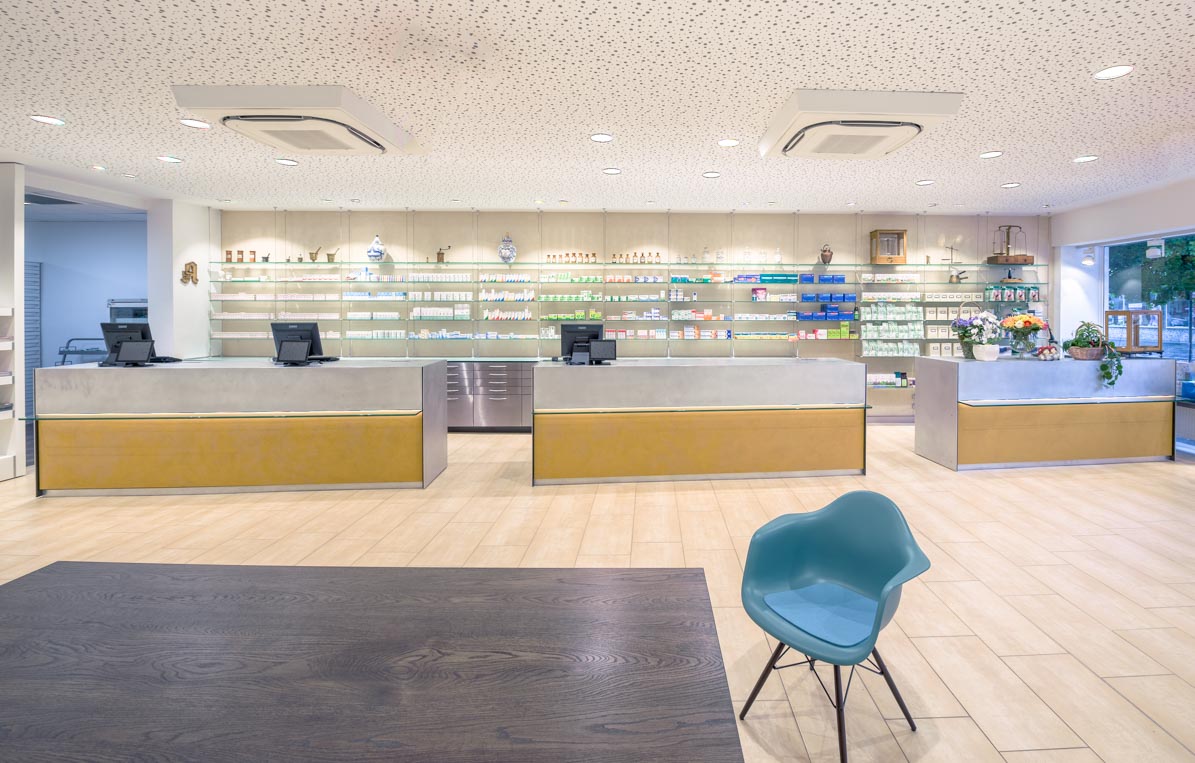
Dispensing counters and shelving.
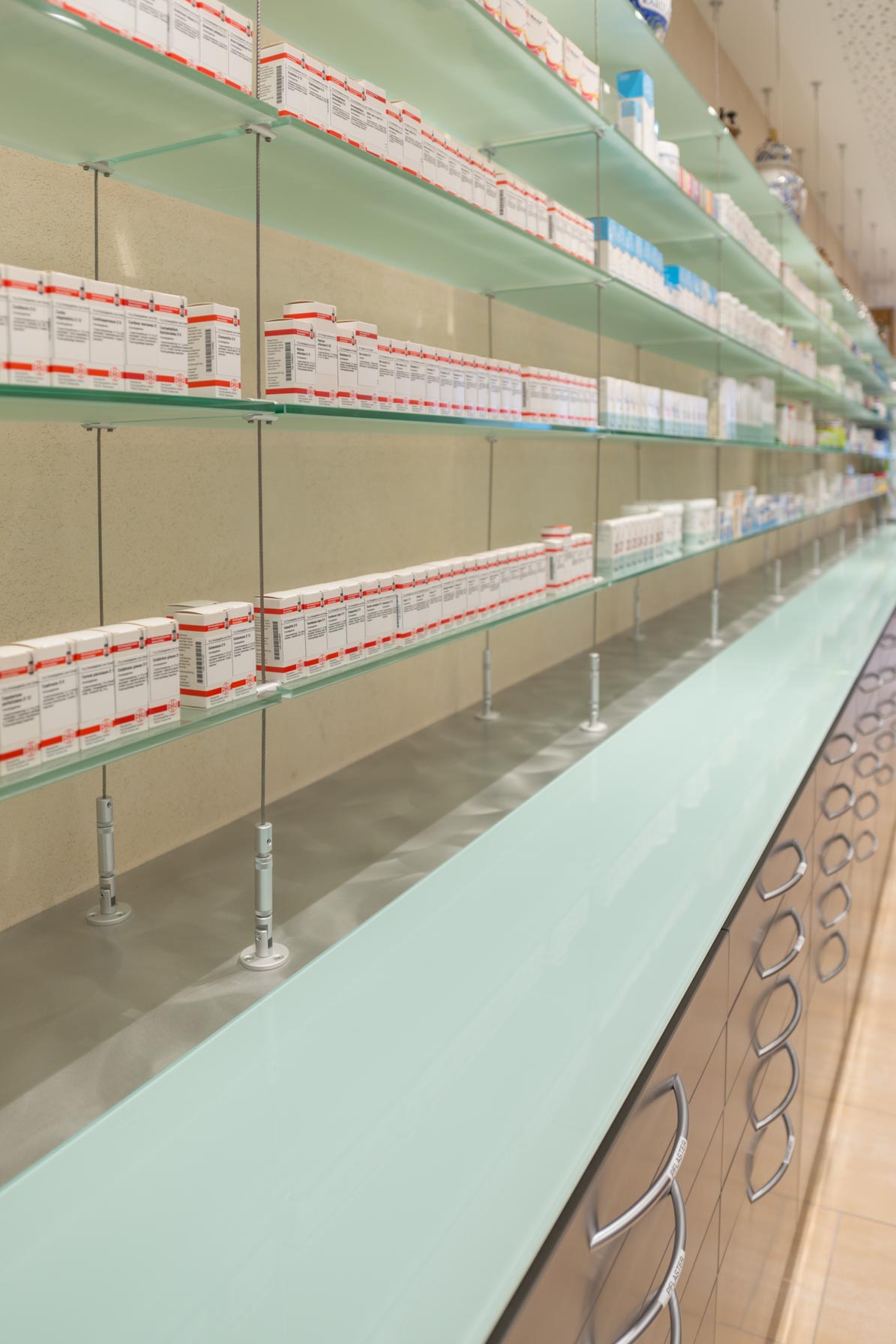
Rear-painted glass shelf.
The entrance received an automatic sliding door and a large entrance mat. A small emergency-service hatch was integrated into the wall between the entrance and the dispensary, allowing staff to keep an eye on arrivals.
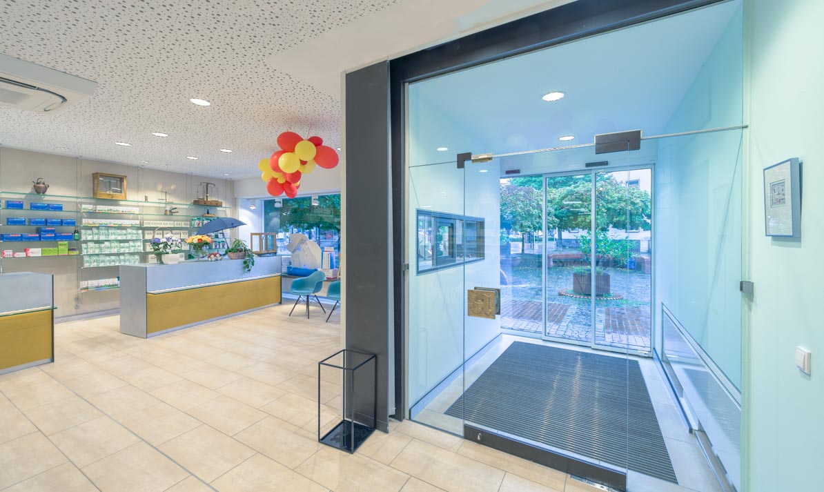
The turquoise shelving wall continues into the entrance.
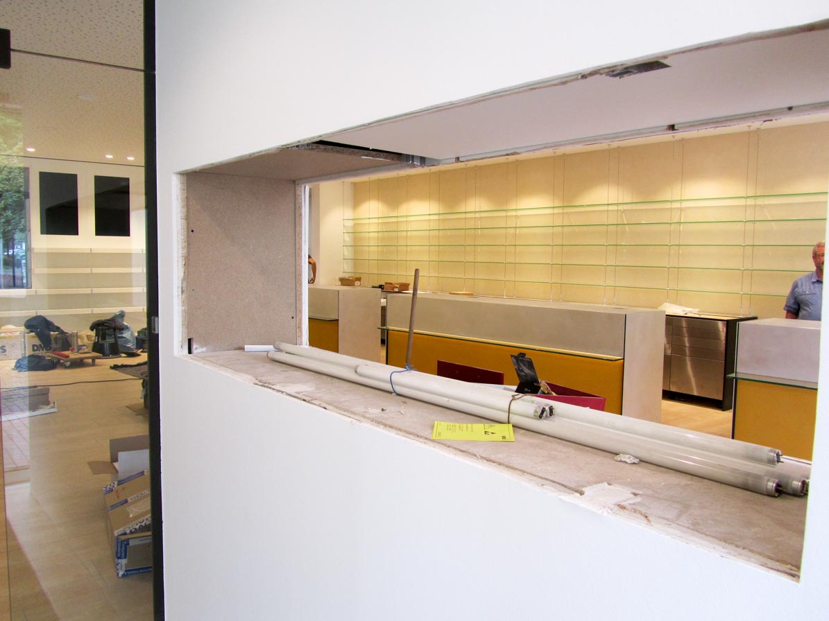
Looking through.
Pimp my dispensing counter
As you have probably noticed, the old red dispensing counters were not reused.
Their internal cabinets were.
An aluminium top, an illuminated glass handbag shelf and a waterproof trowelled finish in sunny yellow completely transformed them.
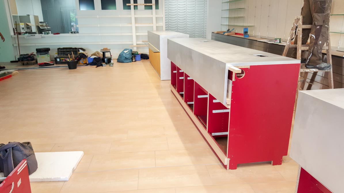
The old cabinet with its new aluminium top.
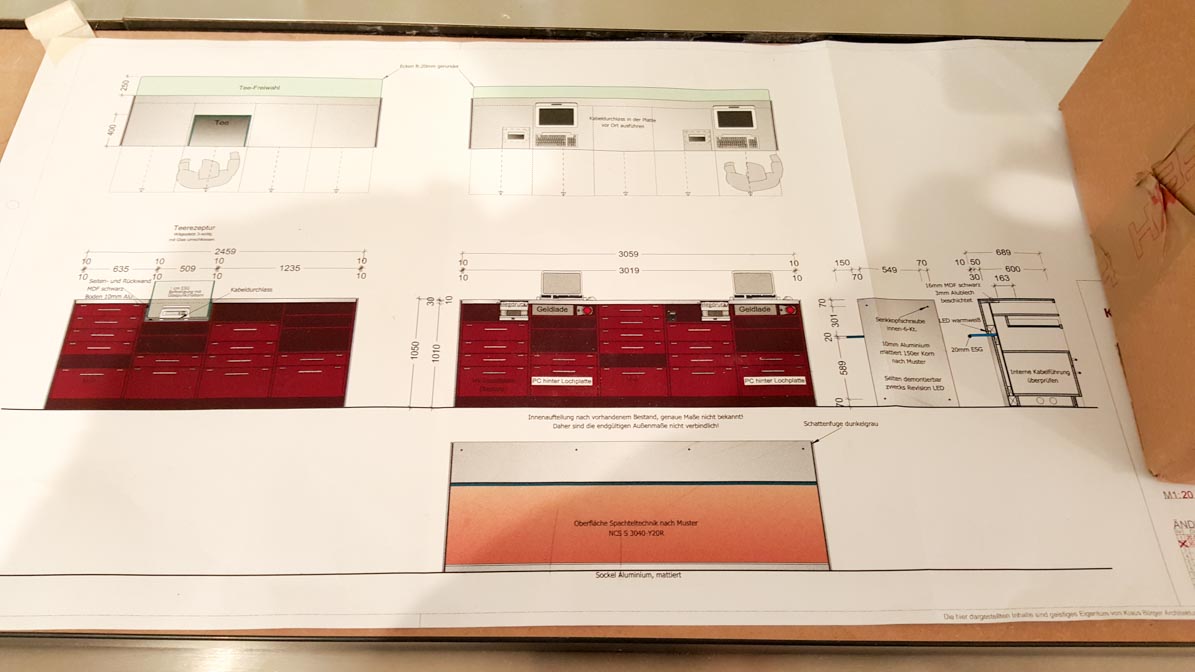
Everything was carefully planned in advance.
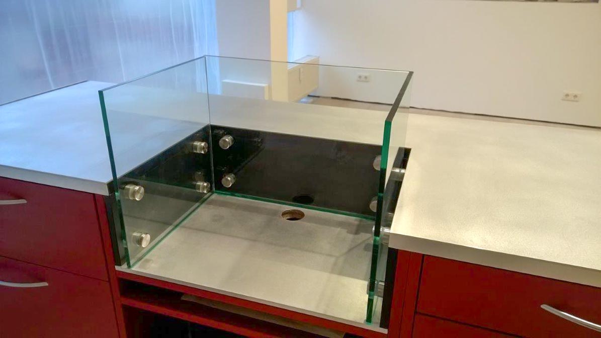
Tea preparation by the shop window.
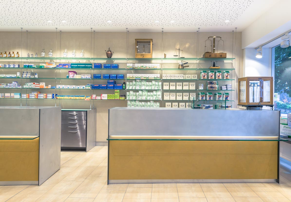
Completed.
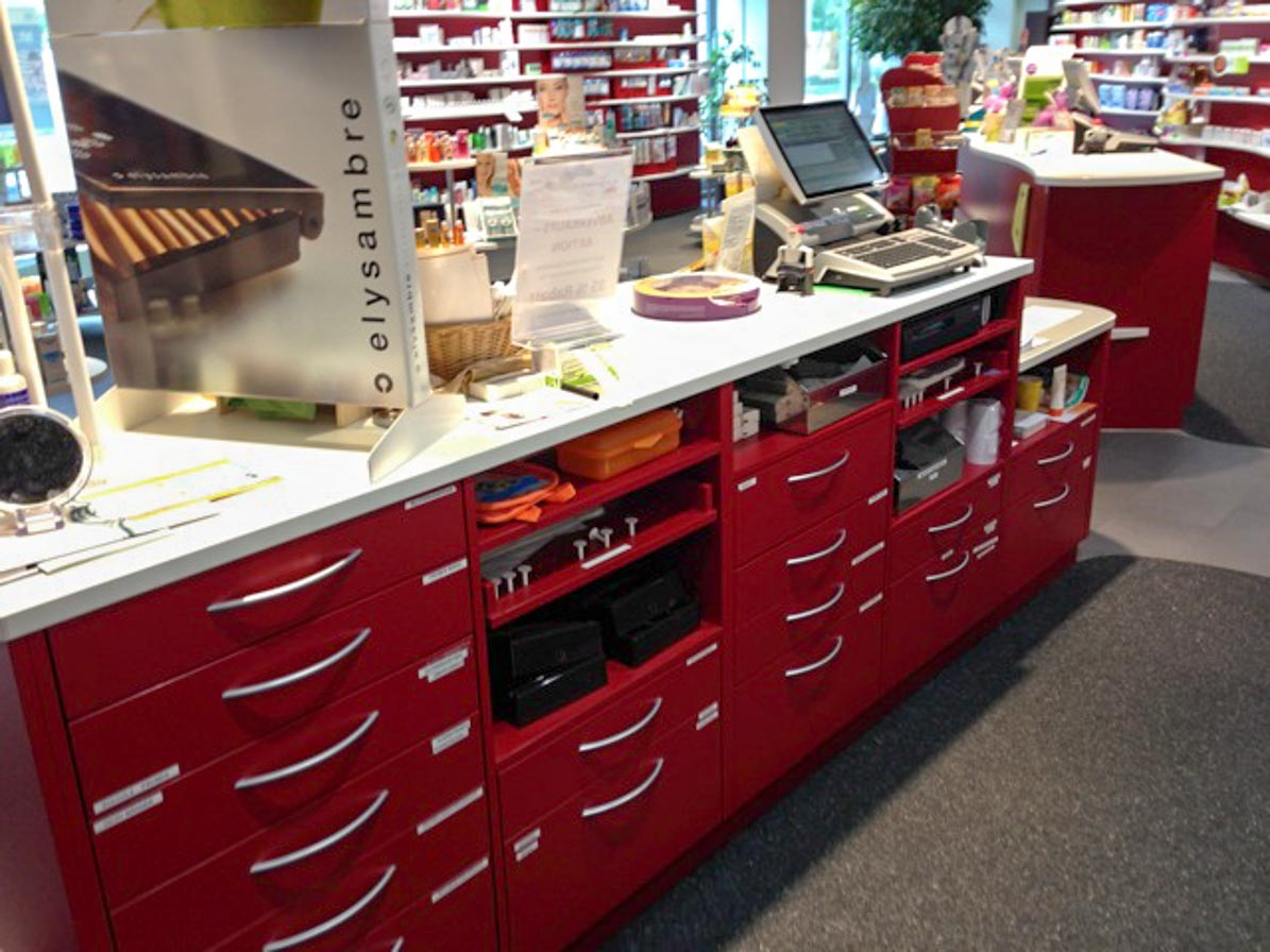
Before.
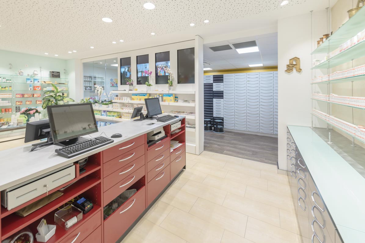
After.
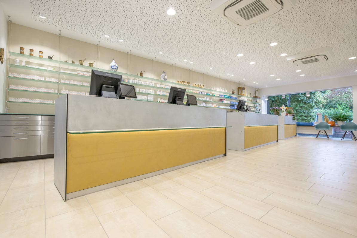
And once more from the front.
The partition to the work area became a piece of furniture in its own right. A large glass panel maintains visual contact with the dispensary.
The four existing monitors were separated and reused as information displays within the shelving.
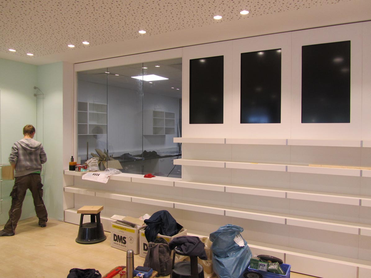
Shelving under construction.
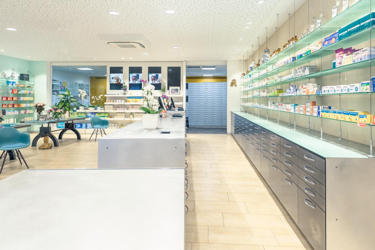
View towards the work area.
Even more existing furniture was reused in the back office.
Old worktops were cut to size, collection shelving found a new home behind the monitor wall, and drawer units became a new copier station.
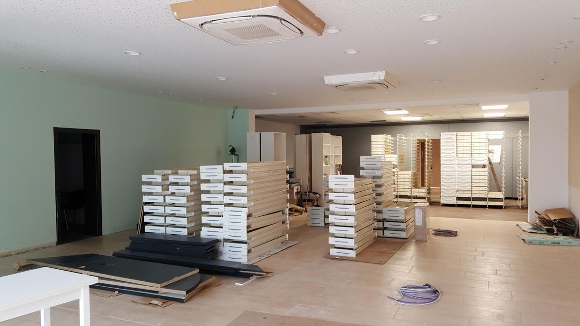
Existing furniture adapted on site.
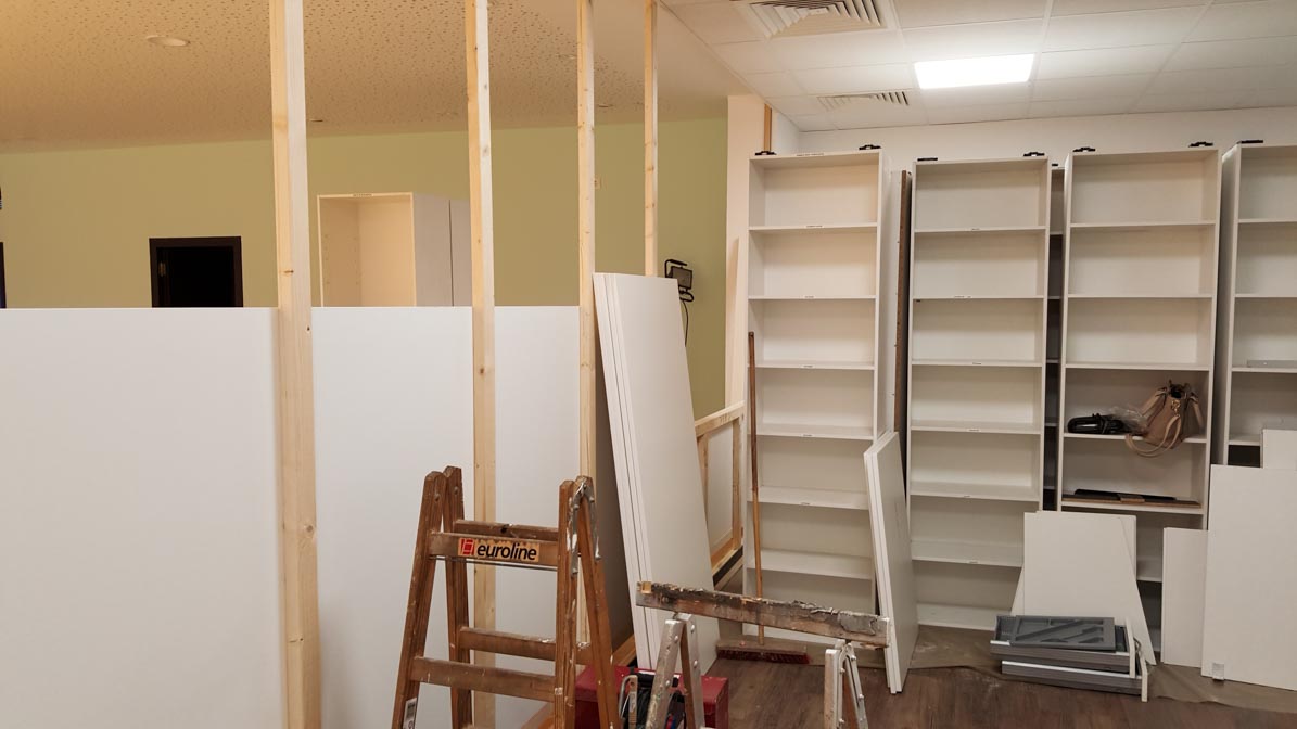
Rear of the monitor wall.
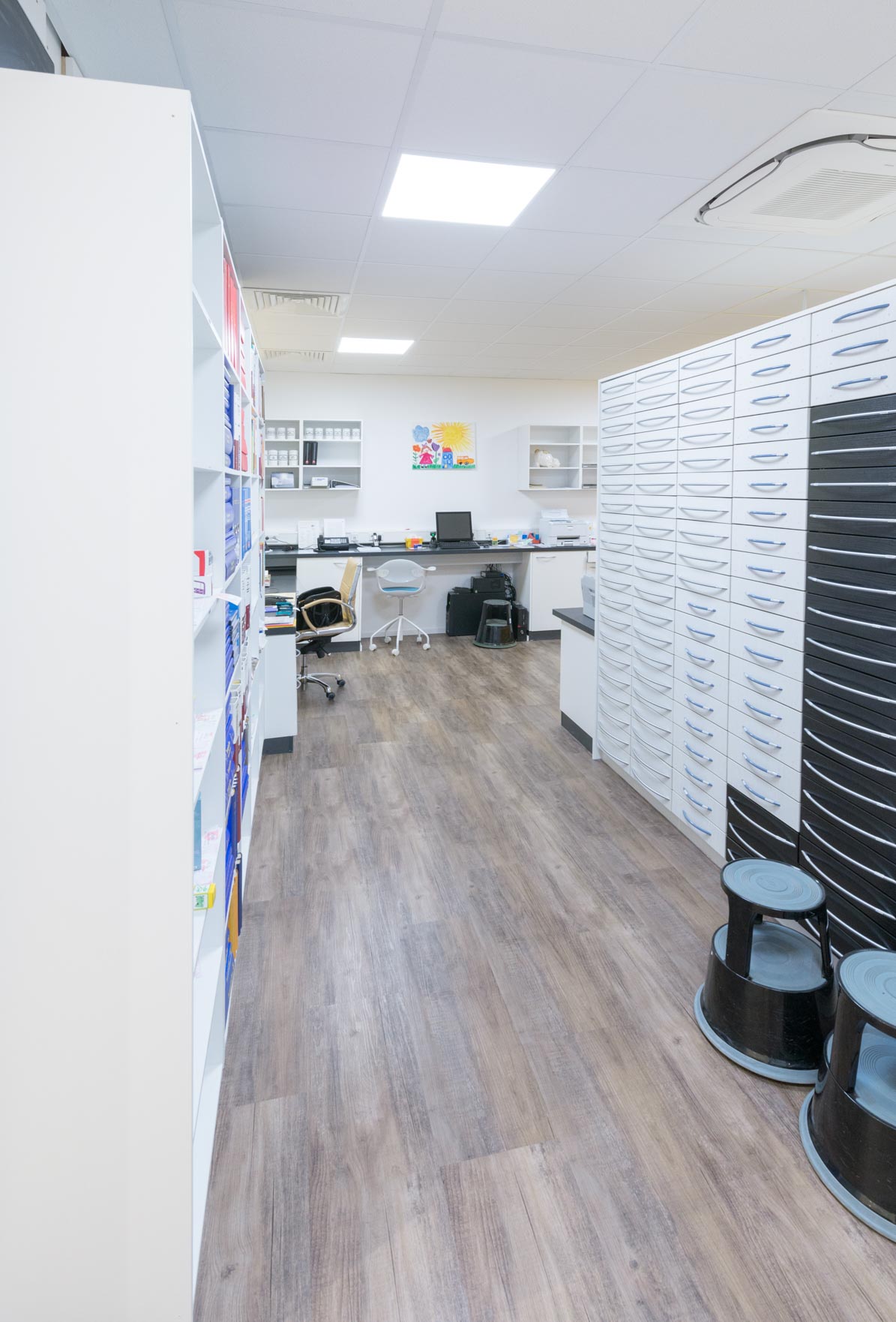
Collection shelving and drawer units.
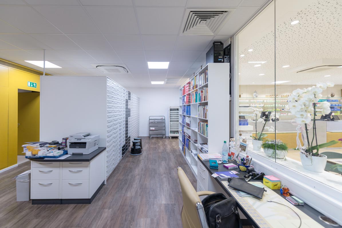
Looking the other way.
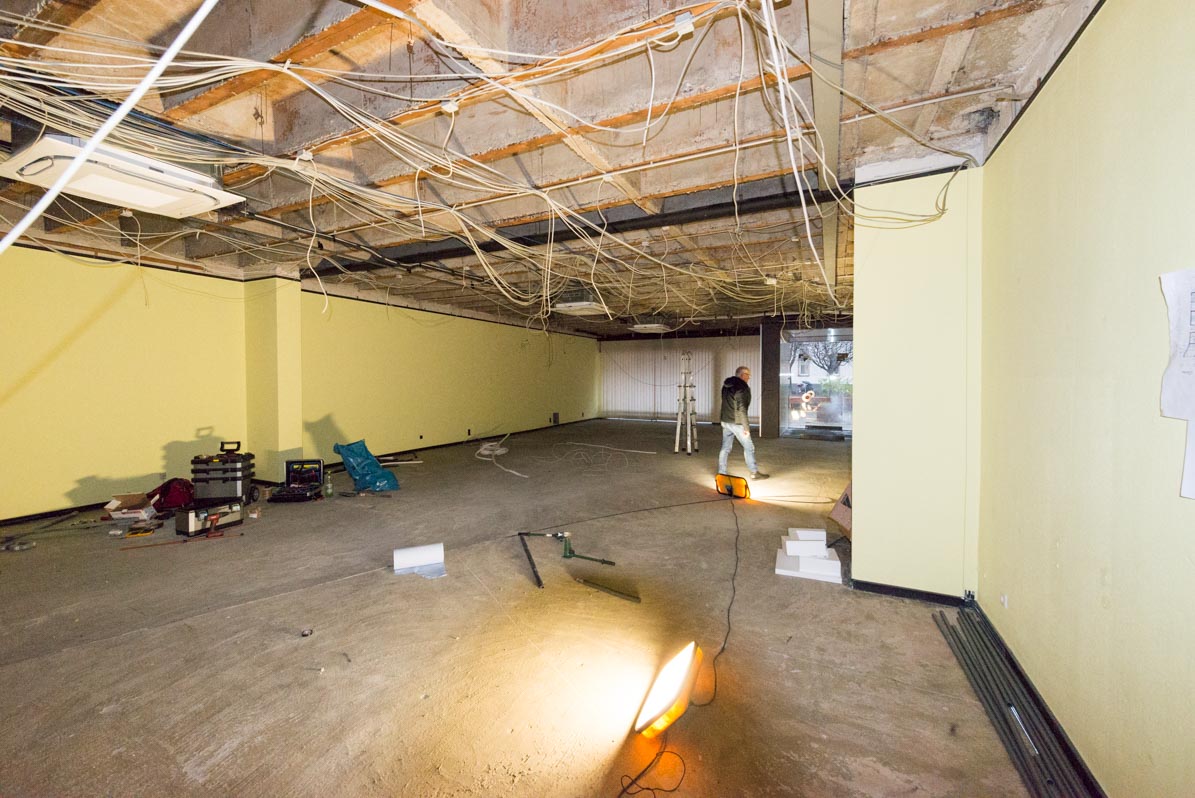
Before.
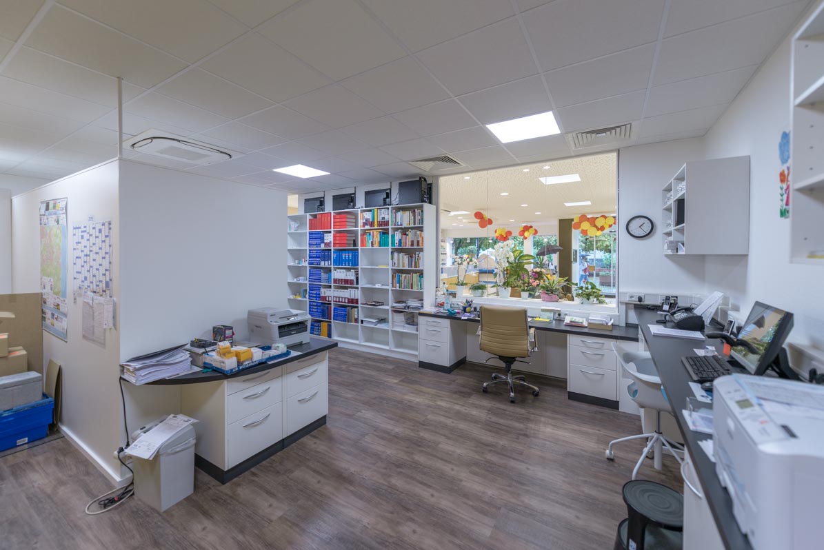
After.
Beautiful inside – what about outside?
The new logo represents an abstract sun surrounded by an aureole.
Instead of turquoise, we chose a darker, more powerful green background so that the sun and typography would stand out more clearly.
Chlorophyll.
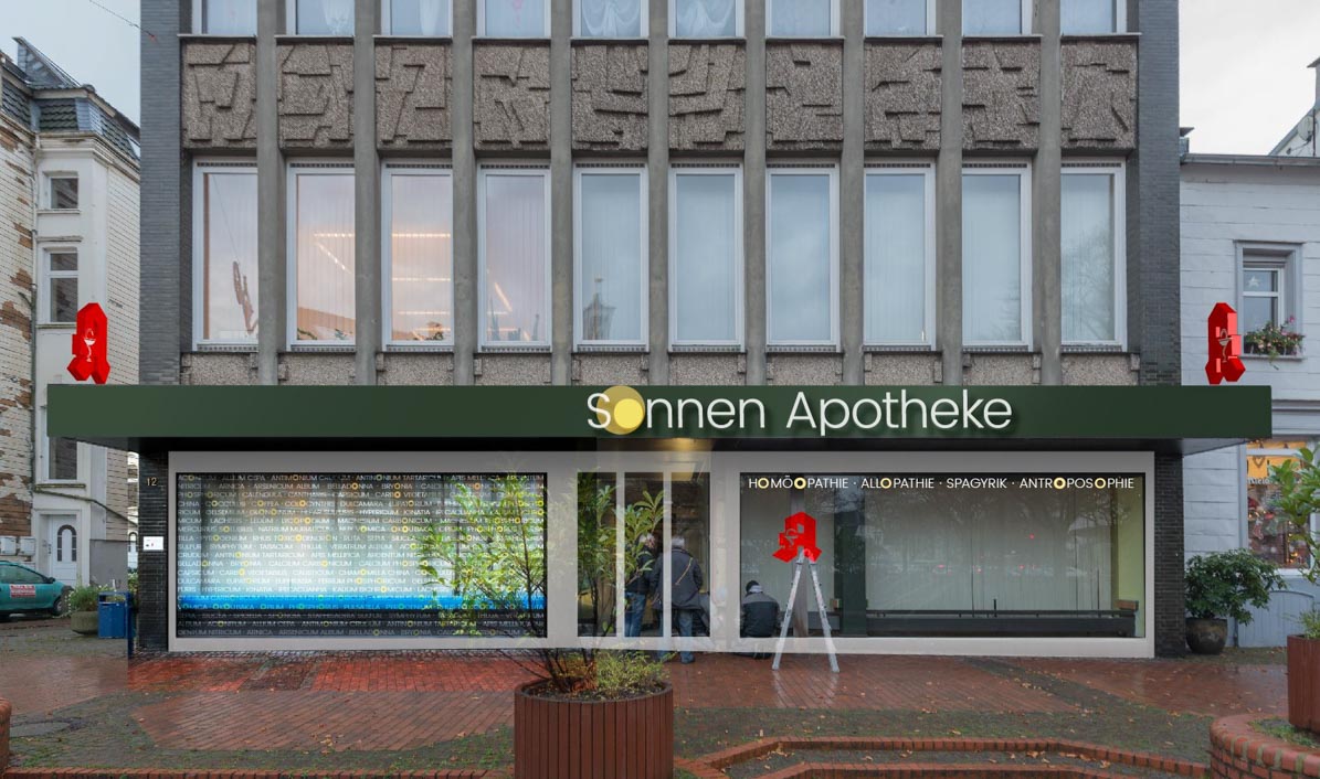
Photomontage visualising the new façade.
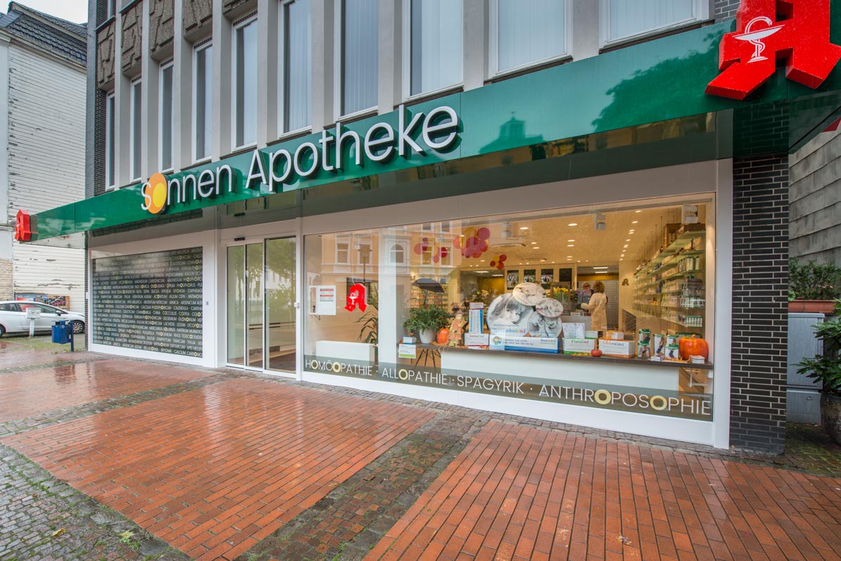
We also designed the logo.
Where else should it go?
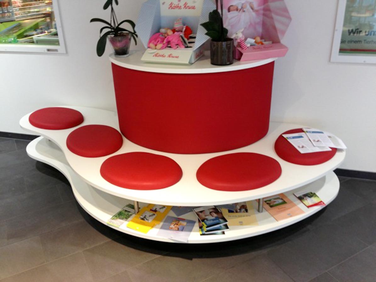
Some of the old furniture was donated to a kindergarten.
Finished!
About us
We are the right partner for people who refuse to settle for standard solutions. Together we develop unconventional ideas and turn ambitious visions into reality.
Above all, we value productive collaboration with our clients.
Let our passion for creating something extraordinary inspire you.
Call us: 0 21 51 – 73 60 05